
Atharva
Back to work

Neurofleet · Fleet operations · Mobile

Tracking the ride
wasn’t improving the delivery.

A driver-app redesign that turns trip data into clearer feedback, with a simple view of the next ride, performance and ride history.

Placeholder
Home
Placeholder
Home · dark
Role
Product Designer, UX Researcher
Team
PM · full-stack team
Timeline
1 month
Focus
Driver app

Problem

V1 tracked time and route, but drivers got no clear feedback and managers had no usable history for assignments.

Solution

A driver app built around the next ride, explainable performance and a trip history people can revisit.

Impact

83% safer deliveries and 72% engagement, shaped by 14 driver interviews.

Problem

Tracking the route. Missing the feedback.

Neurofleet supported client and internal material deliveries. Delays and damaged materials led to complaints, yet V1 only recorded activity.

Where V1 left the loop open
  1. Material requestedBy a client or internally
  2. Driver assignedOn availability and familiarity
  3. Trip completedUnder real road conditions
  4. Time and route recordedNo reliable performance history
  5. Next assignmentSame limited context, no clear feedback
  • Movement was visible

    V1 recorded activity without explaining what would help the next delivery.

  • Assignments lacked context

    Managers relied on availability and route familiarity, with no organized view across trips.

  • Feedback was unclear

    Drivers faced complaints and sometimes payment consequences without knowing what to improve.

Research

Two sides of the same failure.

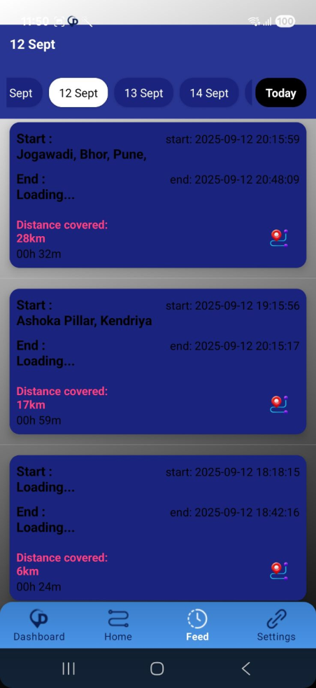
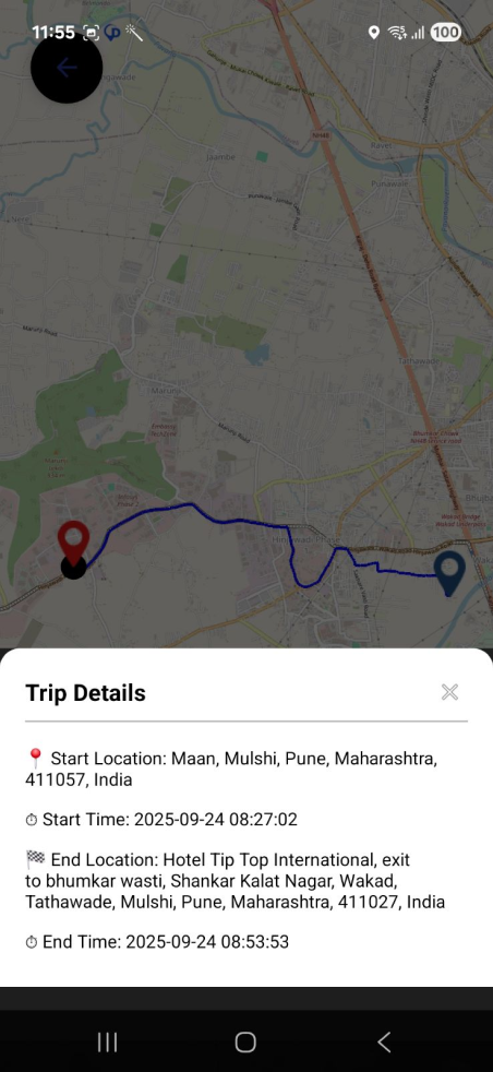
Neurofleet V1 trip feed with dated trip cardsNeurofleet V1 route map and trip details
14

fleet-driver interviews, held offline

  • 2 round-trip ride-alongs with two developers
  • A review of how managers assigned drivers and used V1 data
ThemeWhat I foundWhat it meant for the design
TransparencyAssessments didn’t explain which behaviour could improveShow clear performance categories with optional detail
HistoryManagers had no organized performance record across tripsMake trip records and patterns easy to revisit
Road contextRoad quality and traffic shaped delivery experiencesKeep context visible and avoid blaming every event on the driver
UsabilityDense screens, small text and low-visibility controls increased effortBuild a clearer hierarchy with consistent, readable patterns

Core insightDrivers and managers had different versions of the same problem:performance information wasn’t becoming useful feedback.

Strategy

A ride should lead to useful feedback.

A five-whys analysis pointed to a coordination problem, not simply a driver problem. I focused on the driver app, designed as part of a wider manager–driver loop.

My focus: the driver app

  1. ReadinessUpcoming and recent trips
  2. UnderstandingSafety and general parameters, with optional detail
  3. ContinuityRide history and trip details

Wider service concept

  • Assignment support for managers
  • Trip data integration
  • A feedback handoff
The proposed feedback loop
  1. Assign a tripManager concept
  2. See the upcoming rideDriver app
  3. Trip capturedIntegration dependency
  4. Review trip and performanceDriver app
  5. Inform the next assignmentManager concept

Useful before and after. Quiet during the ride.

Driving is the primary task, so detailed review belongs before or after a trip. More time in the analytics wouldn’t, by itself, mean safer driving.

Design challengeHow might we help drivers prepare, understand their performance and improve,with clearer context for managers?

Key decisions

Four decisions that shaped the product.

01

The next ride first, then the bigger picture

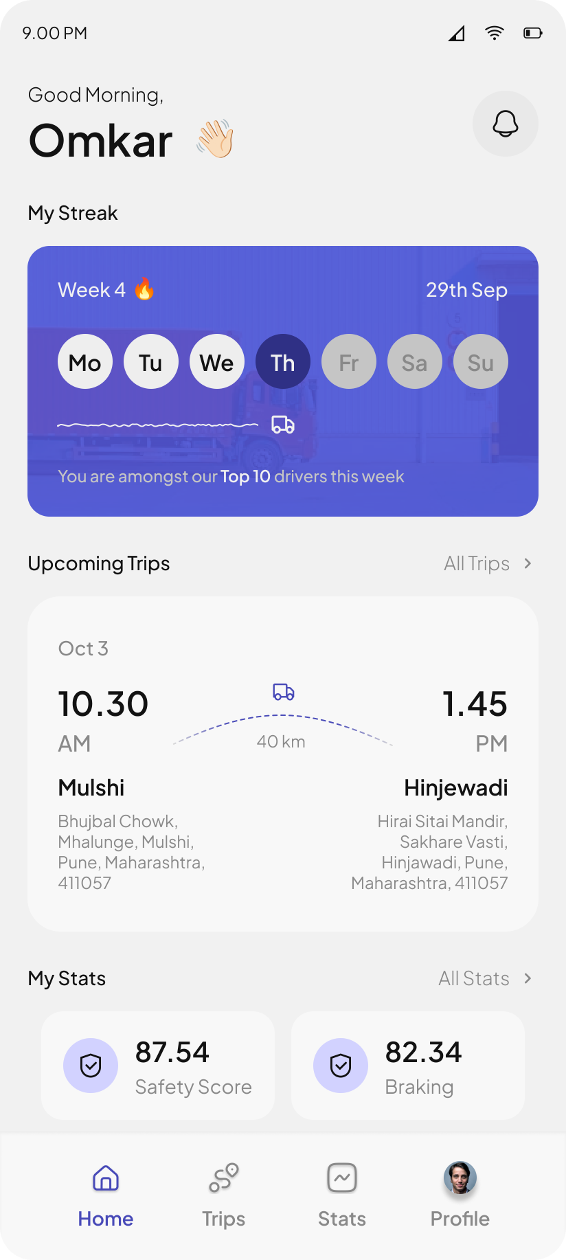
A simplified home built around the upcoming or recent trip, with a performance snapshot within reach. It answers the immediate questions first: is a trip assigned, and where is it going?

Trade-offA streak could add recognition, but it must not reward speed, unnecessary driving or phone use on the move.
02

A number needs an explanation

Performance splits into Safety and General Parameters, with guidance on demand, so drivers can check a summary or choose to go deeper.

Trade-offA score can look objective without being fair, so it shouldn’t be the sole basis for pay, discipline or assignments.

Safety parameters
General parameters
Score detail and guidance
03

Bring it back to a real trip

Ride history sorts by date, distance and time, then opens into trip details, so feedback connects to an actual delivery instead of an abstract score.

Trade-offHistory isn’t proof of cause. Harsh braking may reflect road conditions, traffic or cargo.

Ride history
Sort trips
Trip details
04

Less to decipher, more to understand

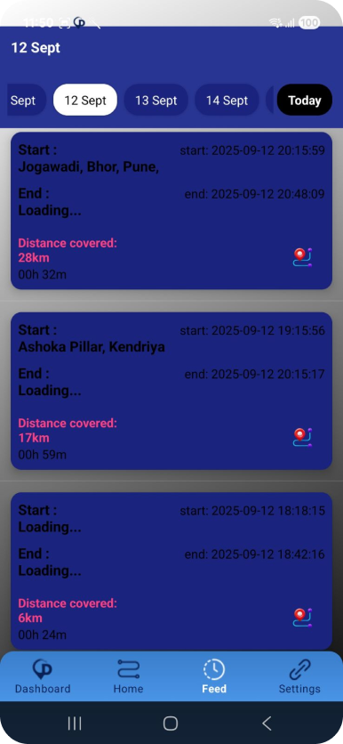
V1 had inconsistent patterns, color overload, small text and hard-to-see controls. The redesign uses a calmer hierarchy, consistent patterns and both light and dark themes.

Still to testLegibility, contrast and comprehension in real driving and lighting conditions.

Before · V1After · Redesign
Redesigned Neurofleet Home with upcoming trips and safety stats Original Neurofleet trip feed with dense blue trip cards

Final design

A calmer way to prepare, review and improve.

  1. See the next rideWhat’s assigned and where
  2. Complete the tripThe app stays out of the way
  3. Review performanceSummary first, detail by choice
  4. Revisit historyPatterns across real trips

Outcome

Safer deliveries. Clearer feedback.

The redesign covered next rides, trip history, explainable performance and optional guidance.

  • 83%Safer deliveries
  • 72%Engagement
  • 14Driver interviews behind the redesign

What I learned

The most useful lesson came from leaving the screens. Interviews revealed frustration, ride-alongs revealed road realities, and managers showed that recording information isn’t the same as using it. Design around the questions people need answered.

What I’d validate next

  • Comprehension of score explanations
  • Usefulness of post-trip feedback
  • Manager use of history in assignments
  • Ways for drivers to question incorrect events